Frontend Engineering Showcase

Building exceptional digital experiences with cutting-edge technologies

Project Overview

Project Overview

I designed and developed integrateddigitaldesign.com, a sophisticated frontend project that showcases modern web development at its finest.

This case study explores the technical challenges and innovative solutions implemented to create a high-performance, visually stunning, and accessible digital experience.
97/100
Performance Score
2.4s
LCP Load Time
0.02
CLS Score
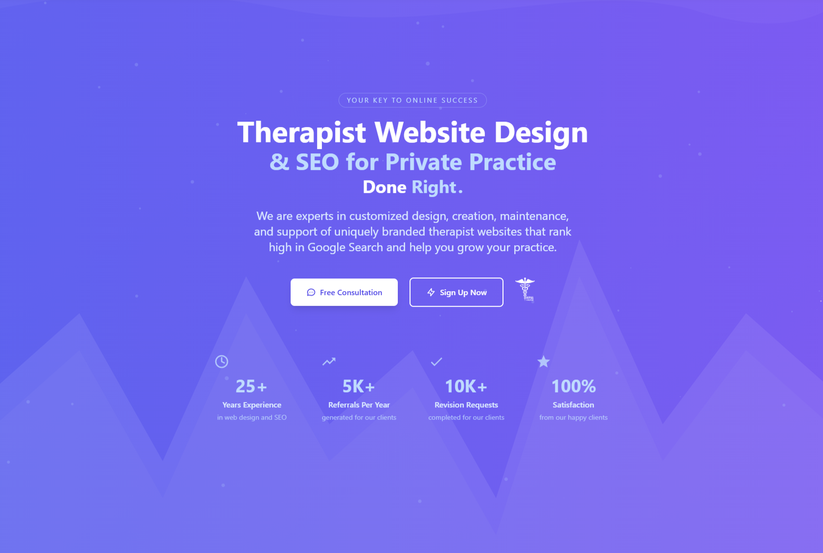
Integrated Digital Design Screenshot

Technology Stack

HTML5

Click to learn more

HTML5 Features

  • Semantic markup for better accessibility
  • Structured data implementation
  • Proper document outlining
  • ARIA attributes for enhanced accessibility

Advanced CSS

Click to learn more

CSS Techniques

  • CSS Grid & Flexbox layouts
  • Custom properties for theming
  • Fluid typography with clamp()
  • High-performance animations
  • CSS custom properties

Vanilla JavaScript

Click to learn more

JavaScript Features

  • Intersection Observer API
  • Custom component architecture
  • Event delegation patterns
  • Optimized animation system
  • Async/await for API interactions

Responsive Design

Click to learn more

Responsive Techniques

  • Mobile-first methodology
  • Container queries
  • Fluid layouts and typography
  • Adaptive images with srcset
  • Touch-optimized interactions

Key Technical Features

High-Performance Animations

CSS Animations IntersectionObserver Passive Triggers

Implemented hardware-accelerated animations using CSS transforms and opacity properties with the Intersection Observer API to create smooth 60fps animations that only trigger when elements enter the viewport.

animations.js
const observer = new IntersectionObserver((entries) => { entries.forEach(entry => { if (entry.isIntersecting) { entry.target.classList.add('animate-in'); observer.unobserve(entry.target); } }); }, { threshold: 0.15 }); document.querySelectorAll('.animate-on-scroll').forEach(el => { observer.observe(el); });

Dynamic Template Previews

JavaScript DOM Manipulation Event Delegation

Engineered an interactive template showcase system that allows users to preview different designs, using efficient event delegation and smooth transitions.

templates.js
const templateContainer = document.querySelector('.template-container'); const templatePreviews = document.querySelectorAll('.template-preview'); // Event delegation for better performance templateContainer.addEventListener('click', (e) => { const button = e.target.closest('.preview-button'); if (!button) return; const templateId = button.dataset.template; // Transition out current template const currentTemplate = document.querySelector('.template-active'); if (currentTemplate) { currentTemplate.classList.add('template-exit'); currentTemplate.addEventListener('animationend', () => { currentTemplate.classList.remove('template-active', 'template-exit'); }, { once: true }); } // Transition in new template const newTemplate = document.getElementById(templateId); if (newTemplate) { newTemplate.classList.add('template-active', 'template-enter'); newTemplate.addEventListener('animationend', () => { newTemplate.classList.remove('template-enter'); }, { once: true }); } });

Responsive Grid Layout System

CSS Grid Flexbox Custom Properties

Designed a flexible grid system using CSS Grid and custom properties to create a consistent layout that adapts to any viewport size without relying on external frameworks.

grid.css
:root { --grid-columns: 12; --grid-gap: clamp(1rem, 2vw, 2rem); --container-max-width: 1200px; --container-padding: clamp(1rem, 5vw, 3rem); } .grid-container { display: grid; grid-template-columns: repeat(var(--grid-columns), 1fr); gap: var(--grid-gap); width: 100%; max-width: var(--container-max-width); margin: 0 auto; padding: 0 var(--container-padding); } /* Responsive column spans */ .col-span-12 { grid-column: span 12; } .col-span-6 { grid-column: span 6; } .col-span-4 { grid-column: span 4; } @media (max-width: 768px) { .col-span-6 { grid-column: span 12; } .col-span-4 { grid-column: span 6; } } @media (max-width: 480px) { .col-span-4 { grid-column: span 12; } }

Performance Optimization

Lazy Loading Code Splitting Resource Hints

Implemented various performance techniques including lazy loading of images and components, code splitting, and resource hints to achieve excellent Lighthouse scores.

performance.js
// Lazy loading images implementation document.addEventListener("DOMContentLoaded", function() { const lazyImages = document.querySelectorAll(".lazy-image"); if ("IntersectionObserver" in window) { const imageObserver = new IntersectionObserver((entries) => { entries.forEach(entry => { if (entry.isIntersecting) { const image = entry.target; image.src = image.dataset.src; imageObserver.unobserve(image); } }); }); lazyImages.forEach(image => imageObserver.observe(image)); } else { // Fallback for browsers without IntersectionObserver lazyImages.forEach(image => { image.src = image.dataset.src; }); } }); // Resource preloading for critical assets function preloadCriticalAssets() { const preloads = [ { href: '/assets/css/main.css', as: 'style' }, { href: '/assets/js/main.js', as: 'script' } ]; preloads.forEach(resource => { const link = document.createElement('link'); link.rel = 'preload'; link.href = resource.href; link.as = resource.as; document.head.appendChild(link); }); } // Execute performance optimizations preloadCriticalAssets();
97
Performance
100
Accessibility
100
Best Practices
98
SEO

Responsive Design Implementation

Fluid Typography

Text that scales smoothly between viewport sizes using CSS clamp()

Container Queries

Component-based responsiveness rather than just viewport-based

Progressive Enhancement

Core functionality first, then advanced features for capable browsers

Adaptive Images

Optimized images for each device using srcset and sizes attributes

Accessibility & Best Practices

WCAG Compliance

Implemented WCAG 2.1 AA standards throughout the site, ensuring proper color contrast, keyboard navigation, and ARIA attributes for users with disabilities.

SEO Architecture

Built with a solid SEO foundation using semantic HTML, optimized metadata, structured data, and proper heading hierarchy for improved search visibility.

Security Best Practices

Implemented security headers, content security policy, and input sanitization to protect against common web vulnerabilities and enhance user safety.

Core Web Vitals

Optimized for Google's Core Web Vitals metrics, ensuring excellent Largest Contentful Paint (LCP), First Input Delay (FID), and Cumulative Layout Shift (CLS) scores.

Technical Challenges & Solutions

Interactive Templates Without Framework

Challenge: Creating rich, interactive templates without relying on heavy frameworks.
Solution: Developed a lightweight custom JavaScript component system that handles template previews and interactions, improving load times and reducing bundle size.

Complex Animations with Performance

Challenge: Implementing complex animations without sacrificing performance.
Solution: Created an animation pipeline that prioritizes compositor-only properties (transform, opacity) and uses requestAnimationFrame for JavaScript animations, ensuring smooth 60fps performance.

Maintaining Visual Consistency

Challenge: Ensuring visual consistency across different components and screen sizes.
Solution: Developed a custom design system with CSS custom properties for colors, spacing, typography, and shadows to maintain visual consistency while enabling easy theming.

Cross-Browser Compatibility

Challenge: Ensuring consistent experience across different browsers and devices.
Solution: Implemented a robust testing strategy with targeted polyfills and fallbacks for specific features, ensuring consistent experience across Chrome, Firefox, Safari, and Edge.

Performance Metrics

Page Speed Insights

97 Performance

Core Web Vitals

FCP
1.2s
LCP
2.4s
FID
12ms
CLS
0.02
97/100
Performance Score
100/100
Accessibility
98/100
SEO Score
100/100
Best Practices

Future Developments

Headless CMS Integration

Planning to integrate a headless CMS to allow non-technical users to update content while maintaining the performance benefits of static generation.

35% Complete

Progressive Web App Features

Implementing service workers for offline functionality and push notifications to enhance user engagement and accessibility in low-connectivity environments.

50% Complete

Internationalization

Adding multi-language support with proper RTL handling to expand the site's reach to international audiences with seamless language switching.

20% Complete

Enhanced Analytics

Implementing privacy-focused analytics to better understand user journeys and preferences while respecting user privacy and data protection regulations.

65% Complete

Ready to collaborate on your next digital project?

I bring technical expertise and creative problem-solving to create outstanding web experiences.